Logos are most important part of brands. It shows exactly what the brand is meant for. It also gives an idea about the company and defines how customers can associate themselves with the brand. Companies invest a lot of time and money in deciding their logo as it will exactly define who they are. They also want their logos to be so different that it stands out among the plethora of companies. There are also subtle meaning present in the logos. The hidden messages often say a thing or two about the company. Here is the list of the most iconic logos the world has ever seen:
1FedEx
Advertisement
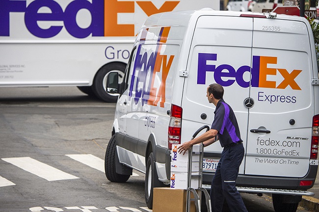
The FedEx is among one of the most iconic logos of all time. If you look at the logo closely, you will find a hidden white arrow placed in it. The designer was successful in placing an arrow between the letters E and x in the logo. The font of x has been adjusted to have the perfect arrow in the logo. The FedEx logo has won almost 40 design awards is also known for the best use of negative space. Lindon Leader was the man who designed this logo in 1994.

Image Source: www.fedex.com
2VLC media player
Advertisement
VLC media player has an iconic logo of traffic cone. It is very popular logo and it is also being loved by most of the people for its simplicity. The logo was apparently used because the students who wrote the code for the VideoLAN project had a traffic cone collection. The logo is very well-known and people identify it easily.

Image Source: www.wikispaces.com
3Domino’s
Advertisement
Domino’s is a very famous pizza brand all across the world. People love to order pizza from the Domino’s. Its logo is also very popular. The logo has three dots in it. When you look at the logo, you will find those dots on the upper side of the logo. The three dots were placed as there were only three stores back then in 1965. They had a planning to add a new dot whenever they will start a new store. But, as the stores started proliferating fast across the world, they decided to stick to the three dots.

Image Source: beetify.com