7Toblerone
Advertisement
Look at the Toblerone logo closely. You will find a bear image hidden in the mountain that represents the Matterhorn Mountain where Toblerone originated. It symbolizes the fact that you need chocolate to survive if you live in the mountains with bears present.
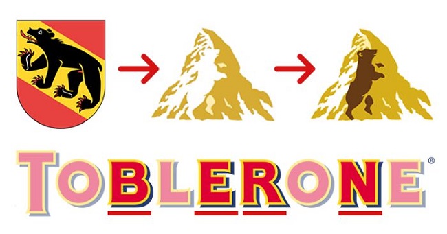
Image Source: www.boredpanda.com
6Milwaukee Brewers
Advertisement
The Milwaukee brewer’s logo is quite a creative and a bit hard to decipher for those who aren’t baseball fans. The glove has been constructed from a combination of the letters “B” and “M”. The team was founded in 1969 and was named after the city’s brewing industry.
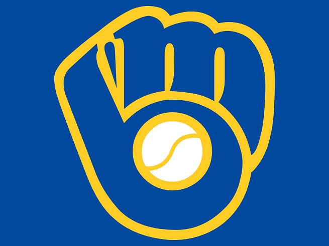
Image Source: www.robotbutt.com
5London Orchestra
Advertisement
This looks a fairly simple logo which most people won’t get at first glance. It could be just about anything if not nothing at all. But if you focus closely on the logo you will then notice how the hidden imagery appears as an orchestra conductor.
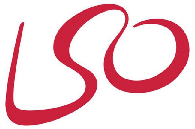
Image Source: www.beyonddesignchicago.com
4Unilever
Advertisement
Unilever sells hundreds of products and there is no way of catching up all of the products under their banner. But take a look at their logo, and you’ll get a fair idea as all of their products have been incorporated into their logo.
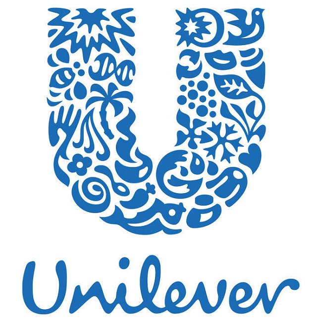
Image Source: www.comedycentral.co.uk
3Coca Cola
Advertisement
The hidden image in Coca-Cola isn’t something that most people in America are familiar with. The hidden mystery image in the Logo of the Coca-Cola is the flag of Denmark which is a big surprise isn’t it? It wasn’t originally intended but then the Danish flag became the symbol of the happiest country on earth and Coke arranged a media event in Denmark’s largest airport where they greeted people with flags. They should have greeted people with coke instead.
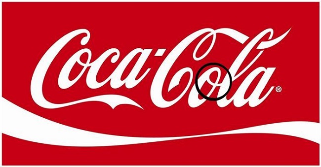
Image Source: www.diply.com
2Gillette
Advertisement
There isn’t much you can make out in the Gillette logo but as a perfect example of the sharpness and precision of their blades, the G and the I have perfect cuts aligned with one another that also represent the sharpness feature of the blades.
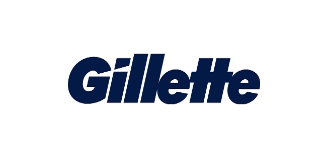
Image Source: www.downwithdesign.com
1McDonalds
Advertisement
The best one yet among hidden images of logos. Everyone is familiar with those famous golden arches creating the letter “M” which obviously stands for McDonalds. But what most people don’t know is the fact that the design created in 1960 by psychologist and design consultant Louis Cheskin was interpreted as a pair of nourishing breasts which he felt would be unconsciously recognized by customers. Seems the guy didn’t have anything else on his mind and need a wife seriously.
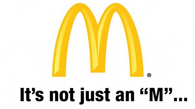
Image Source: www.ytimg.com