14Mammoth
Advertisement
Mammoth is the popular and leading four-season ski resort in California. The logo doesn’t just resemble an “M”. If you look closely, the white spaces resemble the ski slopes; the logo itself is interpreted as a Mammoth and a mountain.
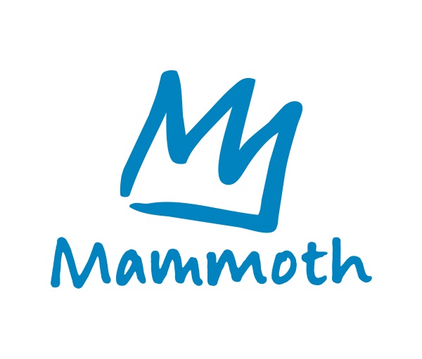
Image Source: www.mammothresorts.com
13Tositos
Advertisement
Among hidden images in logos, this is a fun one. You are used to munching away on their chips but what you didn’t realize is that there is a feast going on in the Tositos logo. Watch the two “T’s they both appear to be men partying over a bowl whose red color within a curve resembles dipping sauce. A great way to say Ole!!
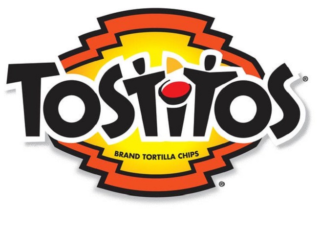
Image Source: twentytwowords.com
12Northwest Airlines
Advertisement
This is a masterpiece of a logo where the N and W have been created as part of the same image. It looks like an N and a W. However there is more to it. There is also a compass integrated into the logo and you can guess which direction it points too. Look at the arrow.

Image Source: www.jones.in
11Tour De France
Advertisement
You may be seeing the words “Tour de France” written and that’s obvious but look closely at the “O” the “U” and the “R”. Along with the yellow dot, they all form an image of a cyclist. It is a truly clever illustration and the model for the pose was none other than a famous cyclist who soon after the shot was asked for a urine sample to be tested for performance enhancement drugs.
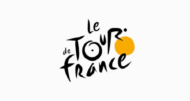
Image Source: www.digitalsynopsis.com
10The LG logo
Advertisement
Pacman has a way of showing up in the least expected places. Take the LG logo for instance. All you have to do is to take the logo and tilt it to the right just a bit. Then the nose has to be shifted upwards and voila, you have Pacman!! The South Koreans were pretty creative it seems.
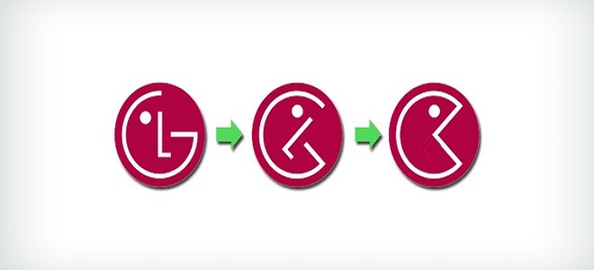
Image Source: www.ebneel.com
9Sony Vaio
Advertisement
Not many have ever given much thought about the Sony Vaio laptop logo because it looks just like a regular typographical design. But there is more to it than meets the eye. Look closely and you will see that the first two letters are a representation of an analog signal. The last two letters symbolize the 1 and O of binary digits of the digital world.
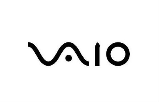
Image Source: www.weburbanist.com
8Hyundai
Advertisement
The automobile giant Hyundai’s logo isn’t just an H standing for the company’s name. It is a stylized version of a silhouette depicting two individuals shaking hands. The color embossed in silver is a fine example of creativity, sophistication, and perfection.
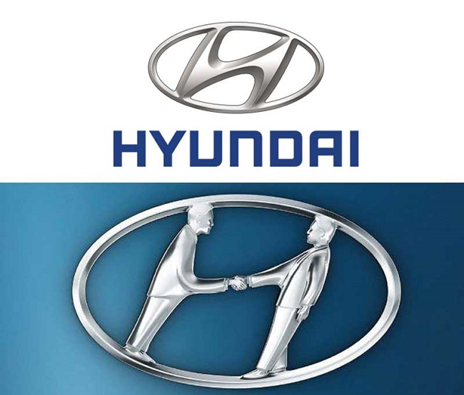
Image Source: www.noisebreak.com