21Wendy’s
Advertisement
The Wendy’s logo was created to symbolize that Wendy’s food was just like your mom's home cooked meals. That is why in Wendy’s collar the design resembles the letters ‘MOM’. Well! It’s as if your mommy made square-shaped hamburgers and used paper cups for ketchup, it would be like Wendy’s no, wouldn’t it?
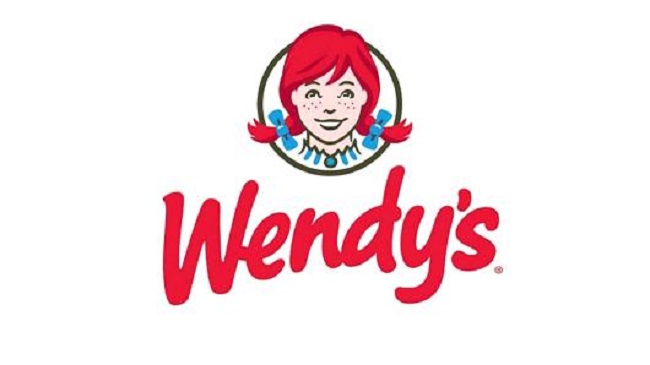
Image Source: www.cnbc.com
20The Pittsburg Zoo and Aquarium
Advertisement
The white space at the side of the tree in the center resembles a lion and a gorilla in a faceoff with each other. Surprisingly though, the lion or rather a lioness doesn’t seem to look that menacing while the ape certainly looks nasty.
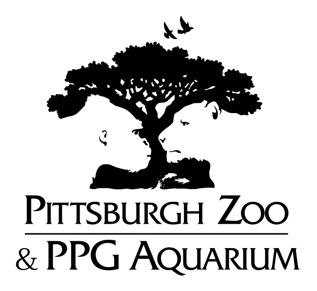
Image Source: www.wikimedia.org
19Chick-fill-A
Advertisement
The Chick-fill-A logo has cleverly incorporated the image of a chicken into the “C”. It doesn’t exactly look hidden but it is still a creative idea deliver the message that they do serve nutritious chicken meals which is the real idea.
Image Source: www.webdesignerdepot.com
18Amazon
Advertisement
The Amazon logo with its curved arrow gives the appearance that the logo is smiling, but the actual purpose of the curved arrow is something else. It starts at the A and points to the Z as an indicator that Amazon sell everything from A-Z which of course is always what you won’t need but will buy anyways.
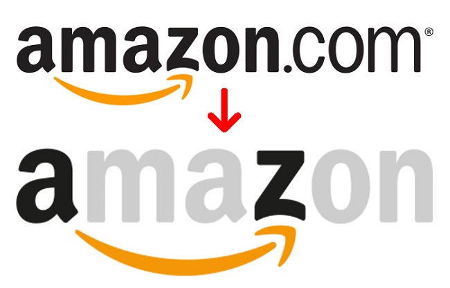
Image Source: www.boredpanda.com
17Baskin Robbins
Advertisement
Baskin Robbins is famous for their 31 flavors created with the intention that a customer would have a new choice every day of the month. They also incorporated the concept of 31 flavors into their logo as well which was pretty neat.
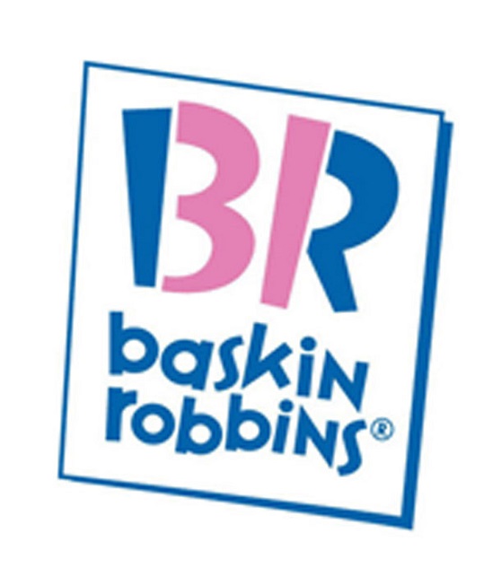
Image Source: www.list25.com
16Formula 1
Advertisement
Everyone knows that Formula 1 stands for the famous racing franchise of formula 1 racing. Look at the logo closely by focusing on the space between the F and the 1 and you will find the ‘Number 1” created as a representation of the number 1 to stand for “formula 1.
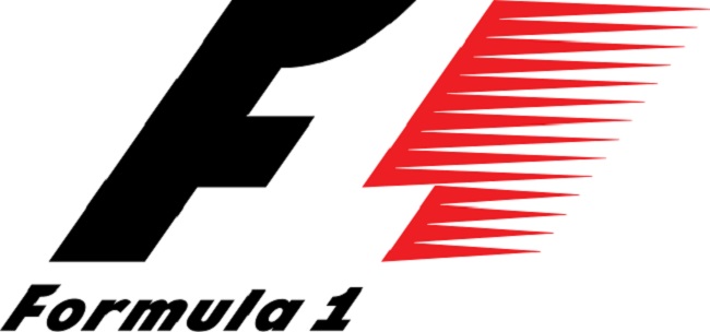
Image Source: www.storyepic.com
15Carrefour
Advertisement
Carrefour is the French International Hypermarket chain which in English means “Intersection”. Looking closely at the logo, you will find that the letter has actually been created by the placement of the two arrows that point in opposite direction which is appropriate in relation to the meaning of the word.
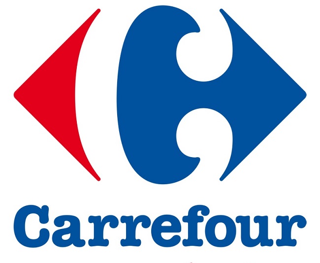
Image Source: www.macotebasque.com