Large companies don’t have logos chosen spontaneously. Much goes into the deliberation of a logo simply because it always started as one man’s dream to achieve a goal of success. Thus logos like McDonalds and the like have a hidden meaning or hidden images which not many know about. These are meant to be interpreted as symbols or meaning associated with the company. Here are 25 such hidden images in logos of famous multinationals around the world
25Fed Ex
Advertisement
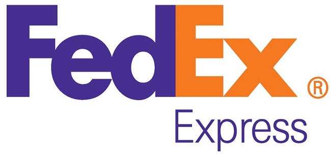
One of the world’s most famously recognized logos, this logistics giant is seen in every country around the world because of its ability to deliver to the most inaccessible locations on earth or so that’s what their advertisements promote. Now, look carefully at the “E” and the “X”. There is an arrow in the white space that symbolizes speed and precision.

Image Source: Fed Ex
24NBC
Advertisement
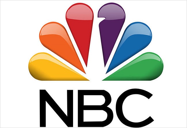
NBC has always been at the forefront of television broadcasting in the USA. Many of the older generation will associate NBC with the famous Peacock symbol but they have now created a new logo and the peacock is still there but it is not that easy to spot although it is there as large as life.

Image Source: www.tvgcdn.net
23Goodwill
Advertisement
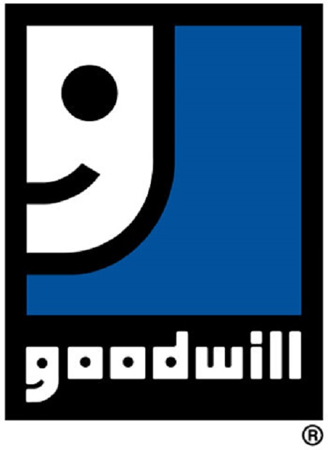
We have seen this logo several times as the symbol of the nonprofit donation and storage center in the US but have you observed how the “G” has been made to resemble a smiling face?? The logo was created by Joseph Selame in 1968 which struck a balance between illustration and typographic.

Image Source: www.hongkiat.com
22Big 10 Conference
Advertisement
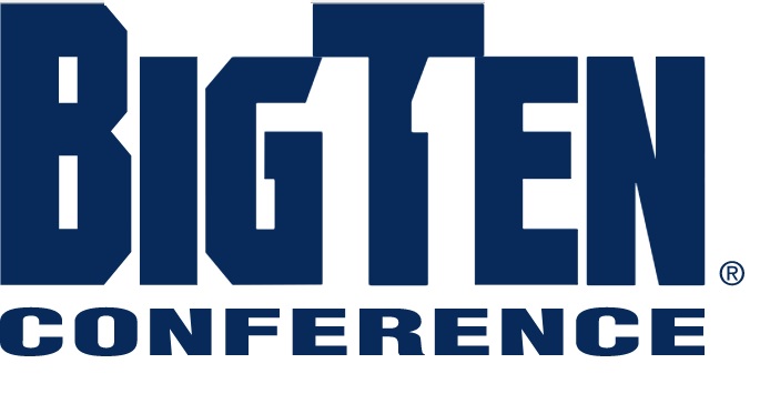
Not exactly a company but there are now 14 members in the Big 10 conference who compete in the NCAA football division 1. The logo was created when there were 11 members after Penn was added in 1990 and since they did not want to change the name they decided to be a bit creative and that’s how an 11 was created as a contrasting space between the letters G, T, and E in the middle.

Image Source: www.nocookie.net